To see the latest range of Swift caravans, look at our round up here
Liz King gives us her thoughts on the thought provoking concept model on the Swift stand at the NEC show.
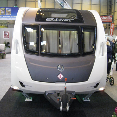
It’s called the Swift Colour Concept Caravan; the clue perhaps a bit cryptic, is in the name so don’t rush off to your nearest Swift dealer and look for it. It’s not a new model range from Swift Caravans, it is what it says it is; a colour concept, a study on interior finishes, and designed to stimulate discussion. It sure did that.
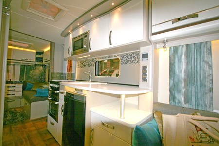
The brief to the caravan’s interior designer, a lively young lady, was to bring in new palettes to communicate a modern domestic environment. The body shell chosen for the design was the Challenger SE 590 which has a centre kitchen and washroom and front and rear living areas.

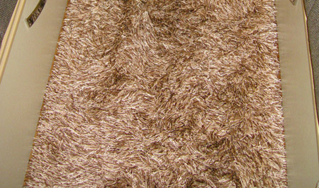
Carpets have been replaced with a birch plank effect wood floor, easy to sweep and wipe clean. A scatter rug press-studded to the floor is cosy on the toes in the living areas; called Shaggy Santa Cruz, think long pile with a myriad of brown threads and silver highlights. You just shake it to clean it and restore the pile, apparently.
The upholstery has a modern theme too, think espresso with flecks of grey in the weave, accented by taupe and gold and teal coloured iridescent scatter cushions.
The canvas look wall boards are a mellowed mocha look and help give a light and spacious feel. Lockers and chest of drawers are soft white with chunky chrome handles and there is a bronze/brown contrast band at roof locker height.
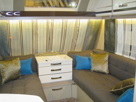
The chrome light fittings are all LED with feature SPLED lights; they are really tiny non-directional lights and complemented by feature strip lights above and below the pelmets. Light bounces off the feature wall in the rear lounge; it’s a charcoal vinyl with a hint of texture and iridescence. Patterned voiles and teal and silver tabards help to hide the window frames and don’t intrude into the caravan like curtains do.
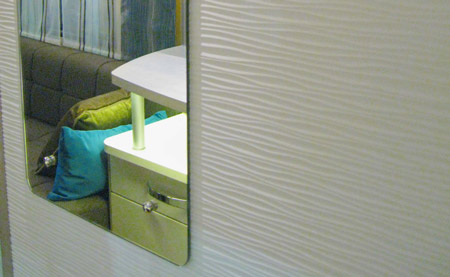
The design brief has got as far as the washroom too; think iPhone shape for the round edged mirror!
The kitchen has a modern splash back with a geometric abstract design in black and charcoal and the worktops are a new white silky look laminate with a delicate twirl design.
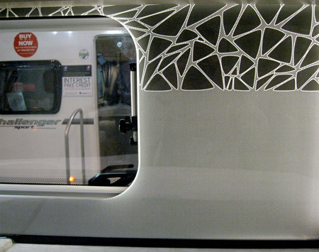
Finally, the exterior graphics are distinctive, yet subtly textured, and take their cue from the geometric abstract design seen on the kitchen splash back.
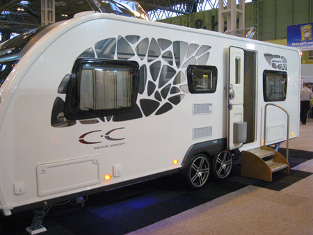
There’s not a price for this caravan as it’s merely a designers’ concept.
Verdict
It’s a fresh look and environment but will caravans look like this in the future? Who knows? I don’t have a problem with caravan interior design taking a leap forward and I admire Swift for being brave enough to canvas the caravanning public’s opinion by asking visitors to the caravan at NEC Birmingham in February to complete a very detailed questionnaire.
I’m told by the caravan’s interior designer that on a day-by-day basis the feedback was generally positive from 80% of the respondents. You can’t please all of the people all of the time, but 80:20 seems a very reasonable ratio. I’d like further analysis though; was it the younger generation that preferred the concept? I don’t count myself in that age bracket, but I don’t like to think of myself as part of the more traditional grey market either!
What do you think? Add a comment below.


At last!!!! A move away from the horrendous 1980’s, cheap velour style interior of the vast majority of caravan interiors. It will be wonderful to have a caravan with an interior as modern as my home. I love the idea of the easy clean flooring with the ‘detachable’ rugs, and how lovely to get away from the normal wood finish. All in all – I love it!!! (and I am a pensioner).
great looking caravan. hope this comes into production soon.iam in my fifties but still twnty one at heart
Like the whole exterior look, gives it a distinctive look of its own. Like the interior as it looks bright and clean but like a lot of the previous comments I think it will date quickly.
I like it, nice and airy, bright and hopefully durable although not sure about the detachable rug.
Like the idea of replacing the carpets with a rug, much more practical especially if the rug is washable.
Eye catching but I suspect that this will go out of fashion quicker than the classic finish. It depends on how long the buyers plan to keep the ‘van and how part-ex or selling prices reflect the design. (Marmite effect?)
I’m also not sure that the designer is a caravanner herself to live with this, but it would certainly be an ice-breaker on-site!
Im not an interior designer but whoever came up with this scheme has done a poor job im afraid. Very bland, grey and unapealing. Look forward to someone making an interior change for the better.
About time we moved on from the same old styles well done
A real mixed bag of comments on this one. I guess this new concept really does have the marmite effect amongst caravan enthusiasts. Thanks for everyone’s views. We’d love to hear more.
Thanks
Craig
Caravan Guard
Sorry can not say it appeals to me. As a designer myself I can appreciate the thought process behind the design, but it appears to me that all the bad elements of design that were prevalent in the sixties have been used. I think it is ghastly.I could not see myself relaxing in such an environment.the outside look of the caravan isn’t too bad but on the whole I think all the design features will date very quickly.
External side graphics look ghastly. Bright interior but not for me. might appeal to younger caravanners but resale would be quite a problem.
Not for me either i’m afraid, i’m a traditional girl and prefer my swift with natural wood, i don’t think the white units are at all practical in a caravan, feel i’d need to be cleaning those all the time, my caravan’s for relaxing!
Hi
I am no youngster and I love the interior finish, but I abhor the exterior graphics on the nearside.
Thank you
John Higgins
I think it looks fabulous on computer. Swift led the field with the sunroof window now copied by many other makes, and they look like leading again if they go ahead with these designs. The overall monochrome effect can be brightened easily with colourful cushions around otherwise could look a bit icy cold in winter months. Maybe not for those with young children or for use at steam rallies, but like all things, there are horses for courses. If they go ahead with it, I hope they make smaller single axle versions.
I think it would make a nice change from the wide variety of wood effects available in the past , lets have a brighter interior finish and ditch those old fashioned wood looks !
My own personal opinion is that I think it looks absolutely revolting. I am all for moving forward but this is not to my taste at all. Go back to the drawing board please!
I do not like it at all, all that white, is it practical? How will it wear and how easy will it be to keep clean, and will the white fade with the sun over time.
Its definetely not for me.
Any design like this is going to date. It’s all good fun, but whatever happens, classic never dates but trend does. It’s a nice ornament, for now.
A great stride forward, I love a more contemporary look
At least it gives a choice, decor has moved forward
But not enough IMO.
Step away from the chintz !
A very nice caravan well laid out with an all over attractive design, but it is far too big for my car to tow.
I was expecting something that was notably avant garde and futuristic. My impression following a short look round was that it was just current modern interior design trends plonked onto and in a caravan. I was underwhelmed and it appears that I’ve seen the future and it’s GREY, which was the overall feeling I got from the van. In fact having read your piece I’m surprised you spotted so much variation and variety, I found it just, well, GREY.
Oh and nobody at the NEC sought my opinion at all.
Love it! A nice refreshing change from wood colour, and I’m no spring chicken myself.
I think it looks very refreshing, a nice move away from the heavy patterned upholstery, some caravan interiors feel a bit oppressive, i love the white cupboards and the wall boards, i think if Swift decide to go this way it won’t do them any harm at all,,
Whilst that colour scheme might look marvelous in some trendy interior designer’s apartment, it looks totally out of place in something which is going to spend a lot of time standing in a field… IMHO.
I have seen this van and i tell you all it looks great. I am in my mid thirties and think this look would be a move forward.
Very nice but not for me.